Project
Dr. Julien Kim
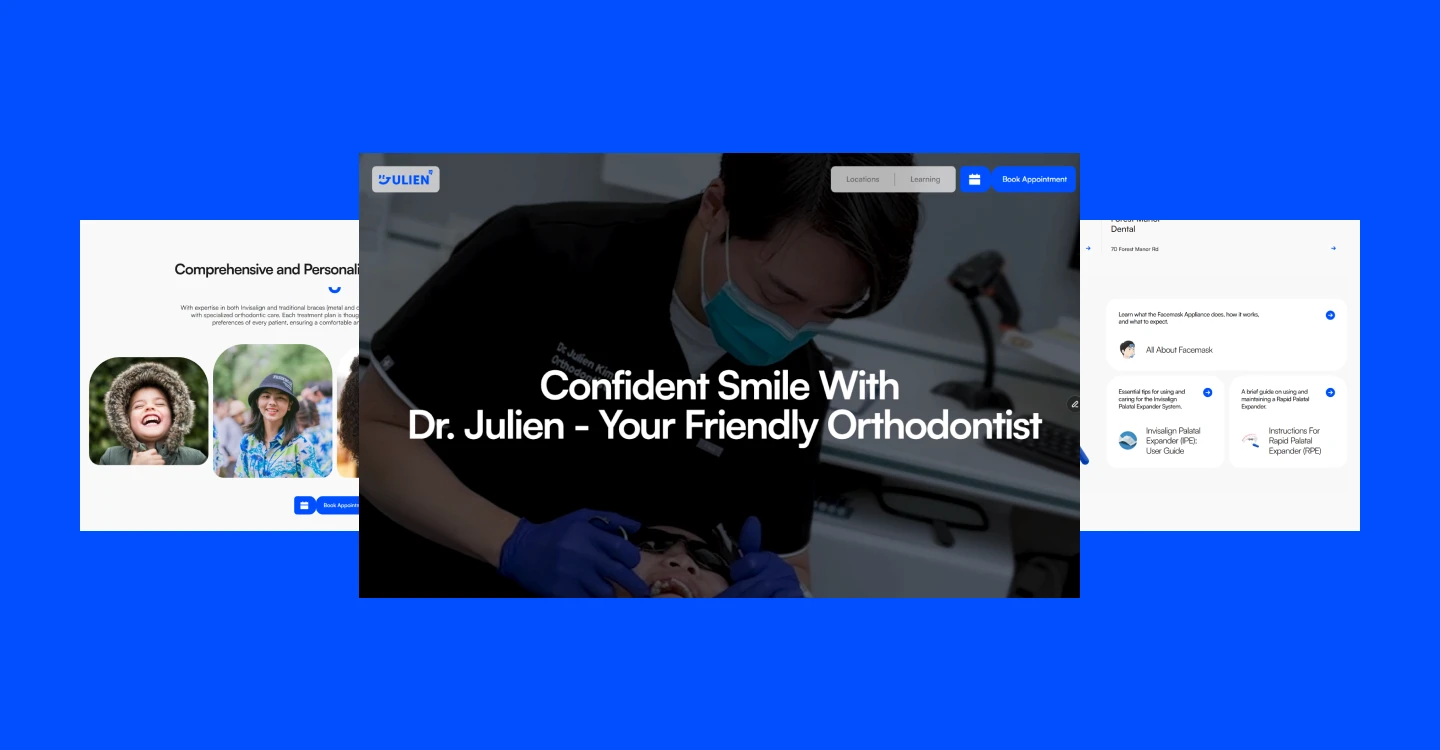
A website and logo system for an orthodontist practicing at 4 clinics, built so patients can find the nearest one.
Year:
2024
Deliverables:
Logo system and website
Duration:
A months for logo, 5 months for website
Overview :
Dr. Kim does not own the clinics he works in. Each of the 4 has its own name, website, and appointment system, and on every one of them he appears as one name in a team list. A patient who found him through his videos had nowhere to go next. Searching his name returned 4 clinics with no indication of which one was closest, which to contact, or whether the orthodontist in the video worked there at all.
Constraints :
Dr. Kim does not own the clinics he works in. Each of the 4 has its own name, website, and appointment system, and on every one of them he appears as one name in a team list.
A patient who found him through his videos had nowhere to go next. Searching his name returned 4 clinics with no indication of which one was closest, which to contact, or whether the orthodontist in the video worked there at all.
Making 4 locations easy to choose between
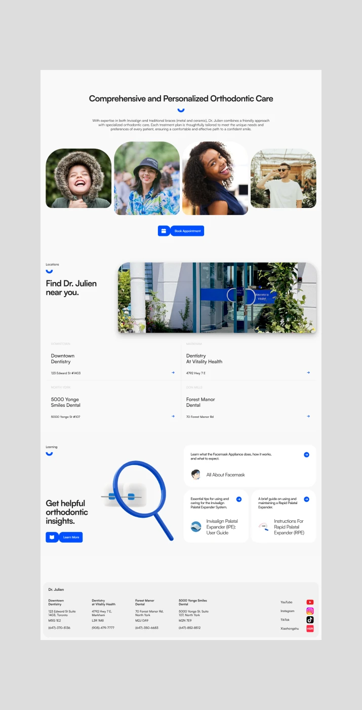
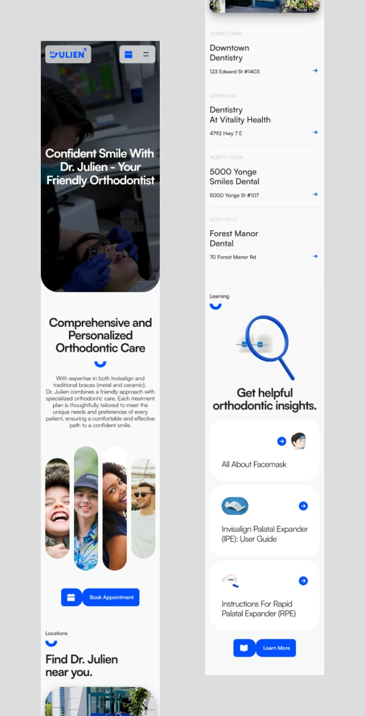
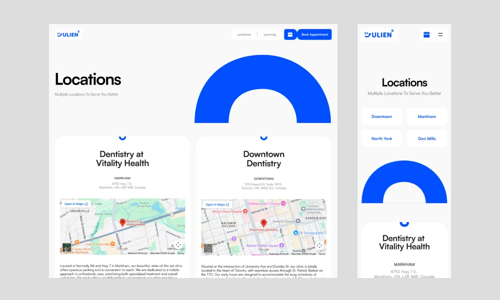
The site had to answer one question before anything else: which clinic should I go to? Every location appears on the home page with the neighborhood it sits in rather than the clinic name alone — Downtown Toronto, Markham, North York, and Don Mills. Patients rarely recognize clinic names, but they know their own part of the city.
The Locations page follows the same pattern in more detail. On mobile, tapping a neighborhood jumps straight to that location card rather than asking the patient to scroll through all 4. The booking form carries a location field, so the choice they already made follows them through to the request.
A face built from his initials
Most of his patients are children and teenagers, and the decision gets made by them and their parents together. A luxury mark, or a clinical one, would have contradicted the way he already explains orthodontics on social media.
I drew a wide range of directions before settling on this one. The mark is a face: DR reads as a pair of eyes, and the J of Julien curves underneath into a smile. A face is the shortest route to the tone his audience already knows him for.

Carrying his identity past the header
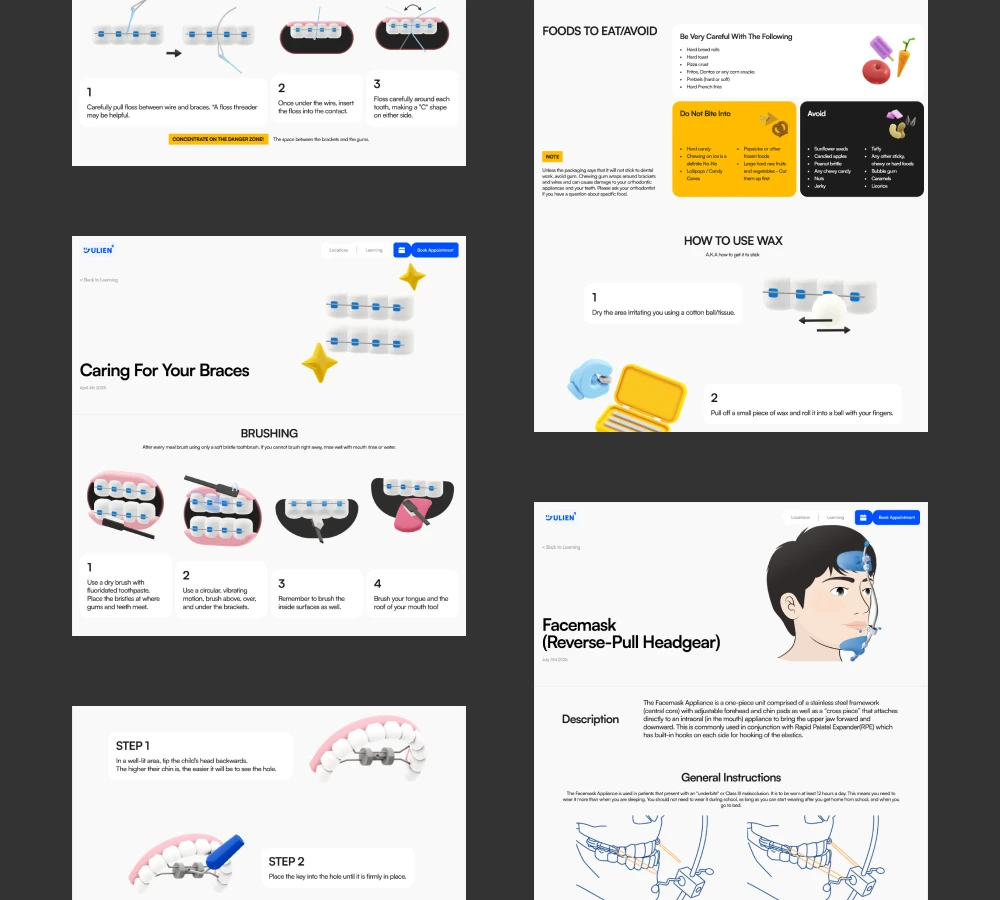
The Learning section is where the tone was hardest to hold. Orthodontic subjects are dry by default, so I modeled 3D graphics for every article thumbnail rather than using stock imagery or clinical diagrams. Each article is laid out to suit its own content rather than poured into one shared template.

Outcome :
The site launched in October 2024 with 8 pages. Dr. Kim now has one address to send people to, and it tells a patient which of his four clinics is nearest and puts them in touch with it directly. It has been revised in place rather than replaced. When he left one clinic and joined another, the location was swapped out. I still handle updates, large and small, three years after the first logo.
Credits
Logo system, design, and build
Jeongheon Yang
3D illustration
Jeongheon Yang
Video
Edited by Jeongheon Yang from footage provided by Dr. Kim
Copy
Drafted by Jeongheon Yang, revised and approved by Dr. Kim
Projects