Project
5000 Yonge Smiles Dental
A 17-page website and a logo system for a dental clinic opening in North York.
Year:
2026
Deliverables:
Logo system and website
Duration:
4 Months
Overview :
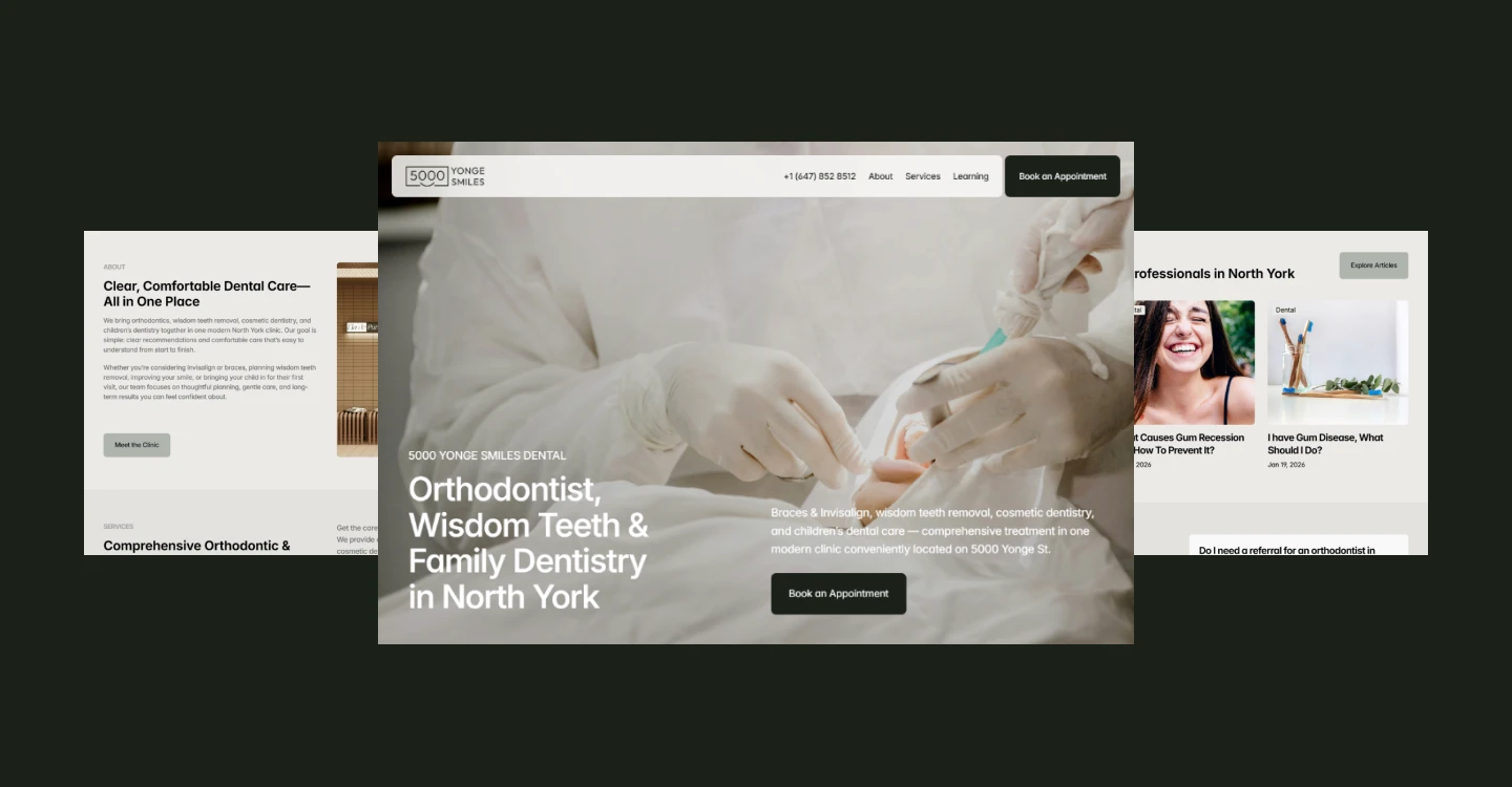
5000 Yonge Smiles Dental is a specialist practice on Yonge Street in North York, with a certified orthodontist and a surgical dentist in the same clinic. The scope was a logo system, a website, and a booking system integration.

Constraints :
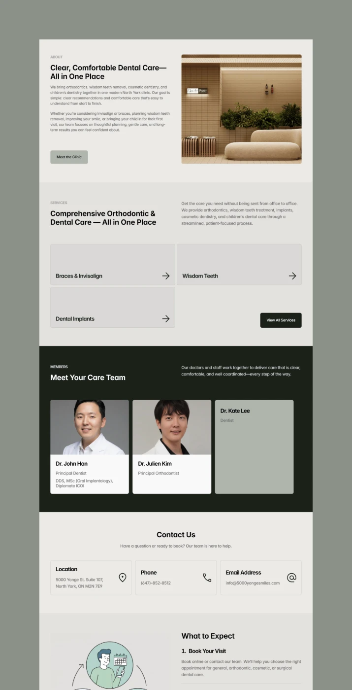
North York is already full of dental clinics, and their websites tend to share the similar color palette and the similar layout. The clinic needed something that didn't look like the rest.
There was also nothing to design from. Construction had not begun when the project started, so there was no space to photograph and no finished material to work with. The visual direction had to be set before the room existed.
Finding what the client actually wanted
I built a questionnaire to set the visual direction. Their answers pointed to trust, professionalism, and friendliness. Over the next few meetings, however, the references they sent and the way they talked about the clinic were more premium than the three words they had chosen.
The questionnaire had captured what they thought a dental clinic should sound like, rather than what they wanted to walk into. I showed them the gap before I changed anything, explained why I wanted to move toward the premium end, and they agreed. Then I started designing.
Designing against the dental category
Almost every clinic in the area uses a blue or teal accent. I dropped the saturated accent entirely and built the palette from 4 neutrals, letting the darkest one — a near-black green — carry the weight an accent usually would. Against a row of blue competitors, restraint was the more visible choice. I avoided the shared layout and the stock smiles for the same reason.
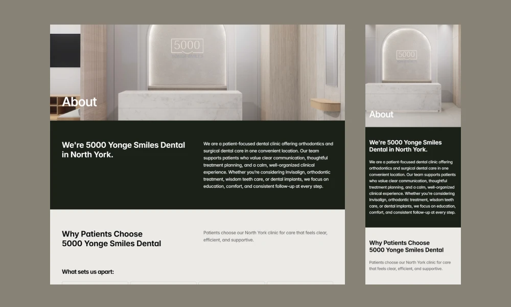
With no interior to photograph, I pulled the palette from the interior concept and the reference images the owners shared. Launch imagery came from royalty-free photography rather than paid stock, since the clinic would replace all of it with real interior photos once the space was finished.
Building search into the structure
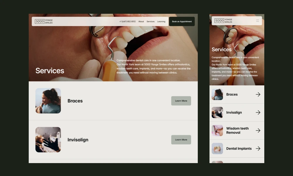
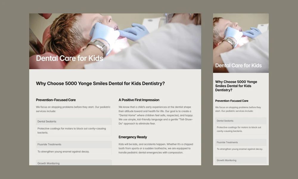
A neighborhood clinic depends on local search, so I built the structure around it. Each treatment got its own page. Patients search for a procedure rather than for a clinic type, and someone looking for one treatment should not have to hunt for it inside a long services page. Separate pages meet each search directly. All 6 come from one CMS collection.
Every page carries a written meta description, and images are named for their subject and neighborhood. The Learning section answers patient questions on the clinic's own domain, where the answers help both search and the patient reading them.
Building a logo system around a mark I couldn't change
The owners had made their own logo and wanted to keep it, so I built the system around it instead of replacing it.
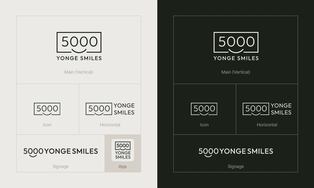
I redrew the spacing and settled the proportions, then chose two typefaces to balance the existing mark: Fustat for the numeral, Outfit for the wordmark. From the default lockup, I extended the system into horizontal, icon, and signage versions, plus an app icon and a favicon that still reads at 32px.

Outcome :
The clinic opened in 2026 with a 17-page site, 4 months after the first meeting: 6 service pages, a team page, the Learning section, and a booking path that hands off to the clinic's scheduling platform.
I held CMS access through launch and moved it to the clinic 2 weeks later, once testing and fixes were done. They update hours, service copy, and team profiles themselves now, and come back to me when something structural changes.
Credits
Logo system and website:
Jeongheon Yang
Logo concept:
Provided by the client
Copy:
Drafted by Jeongheon Yang, revised and approved by the clinic
Photography:
Royalty-free stock, pending clinic photography
Projects